
Once the network had a public website and a sign-in page, it needed to look like one thing. A mark, a wordmark and a small palette did most of that work.
The mark
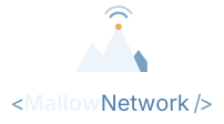
The mark is a pale mountain peak against a blue ridgeline, with a small gold point just below the summit and two signal arcs rising above it. The mountain is the place: the Appalachian ridges of Maryland. The arcs are the connection. Together they say what the homepage says: rooted here, connected everywhere.
It's built from a few flat shapes with no gradients or fine detail, so it holds up as a 16-pixel favicon, a home-screen icon and a social preview image alike.
The wordmark
The name is written in the style of a self-closing tag,
<Mallow Network />: a small nod to the fact that all
of this is put together by hand. In the logo files it sits beside the
mark, with Mallow in the pale peak colour and
Network and the brackets in signal blue.
In this website's header the same idea is set as live text instead of an image: MALLOW heavy and gold, NETWORK lighter and in parchment, the brackets faded back. Text stays sharp at any size, can be read by screen readers and search engines, and costs nothing to download.
Lockups
- Horizontal, for dark backgrounds: the default.
- Mono white: for photos and busy backgrounds where colour would get lost.
- Stacked: the mark above the name, for narrow spaces like phone screens.
- A compact version of the mark for the Cloudflare Access sign-in page in front of the Private Hub.

Palette
There are two small families of colour: the cool blues and gold of the mark itself, and the warm forest-and-parchment tones used for pages and apps.
#EDF4FAPeak#6E9EC2Signal#4E80ABRidge#EDAF52Summit light#132B42Night (app theme)#15221DForest#E7D6A5Gold#FFFDF7Parchment
Type
Headlines are set in Georgia, a sturdy, slightly old-fashioned serif that suits the landscape. Everything else uses the system's own sans serif. No web fonts are loaded at all, which keeps pages fast and keeps the site's Content Security Policy simple.